
AugMend Health
Redesigning AugMend Health’s Digital Presence
Figma, Adobe Creative Suite, WixStudio
July 2024 to August 2024
Product Design
Brand Identity
Research & Strategy
UI/UX Design
Branding
As a product designer at AugMend Health, I was tasked to create a website and brand identity that resonated with both patients and healthcare professionals while aligning with AugMend’s innovative, empathy-driven approach. I conducted competitor analysis, developed mood boards, created custom iconography, and designed intuitive user flows. Collaborating closely with the founders, I ensured that the redesigned site clearly communicated AugMend’s value and provided a seamless user experience.
The new website strengthened AugMend’s brand identity, bringing consistent messaging and a cohesive digital presence. It now serves as a key touchpoint in AugMend’s mission to integrate mental health care into clinical workflows, enhancing both patient outcomes and the efficiency of healthcare teams.

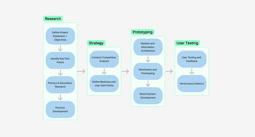
01 RESEARCH & STRATEGY
Holistic analysis of the AugMend Health Website
The overwhelming visuals and text created a cluttered experience, which could frustrate users and lead to early abandonment. In our discussions, it became clear that the weak visibility of call-to-action (CTA) buttons hindered user interaction; making CTAs like "Request a Demo" more prominent and bold would significantly improve engagement. Additionally, the unclear value proposition in the hero section failed to communicate AugMend's unique benefits quickly, highlighting the need for stronger messaging that conveys the platform's impact along with an enticing CTA. These insights have laid the foundation for a more effective user experience strategy moving forward.
Overloaded by text-heavy sections and lack of white space encouraging early abandonment
Overwhelming Visuals & Text

Hidden or passive CTAs leading to lower engagement
Weak Call-to-Action Visibility

Hero section doesn’t communicate AugMend’s
key benefits
Unclear Value Proposition

02 RESEARCH QUESTION
How can AugMend Health’s website design be simplified to create an intuitive, engaging, and empathetic experience for both patients and healthcare professionals?
User Testing
To understand pain points around usability and engagement
Moodboards
To align visual identity with focus on well-being and innovation.
Competitive Analysis
Reviewing leading healthcare platforms to assess their strategy
Iterative
Design
Based on feedback and ensure the redesign captured core values
KEY INSIGHT 1: Simplified Visuals Enhance Engagement
Digestible sections and improved white space organisation reduced cognitive load and increased user retention.

KEY INSIGHT 2: Strong CTA Placement Drives Interaction
Making CTAs like “Request a Demo” more prominent led to significantly improved user engagement.
KEY INSIGHT 3: Clarified Messaging Communicates Value
Strengthening the hero section with a concise value proposition helped users quickly understand AugMend’s benefits.
04 FINAL PROJECT GOAL
Redesign the AugMend Health website to increase user engagement, clarity, and seamless navigation for clinicians
FEATURE 1
Unified Brand Identity
FEATURE 2
Improved
Navigation
FEATURE 3
Strong Value Proposition
Dr. Jennifer Collins
Head of Psychiatry at a
large urban hospital
(45 y/o)
Behaviours
Responsible for evaluating and adopting new healthcare technologies that integrate mental health into patient care
Attends conferences and follows industry trends to stay on top of innovative healthcare platforms
Goals
To find a mental health platform that seamlessly integrates into her hospital's existing systems and improves patient care without adding extra work for her team
Evaluate platforms that enhances the patient experiencewhere there’s potential for innovation
Dr. Mark Whitfield
Chief Medical Officer
at a regional hospital
(52 y/o)
Behaviours
Manages all clinical departments and focuses on improving health outcomes in underserved rural communities
Committed to reducing patient no-shows and burnout among clinicians
Goals
Find a cost-effective, easy-to-implement mental health platform that can be used by both patients and clinicians with minimal training
Ensure any new system can reduce burnout among staff


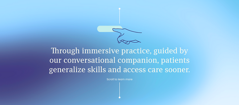
AugMend Health’s brand evolution is driven by one goal: to revolutionise how behavioural health tools are integrated into clinical care.
Rooted in empathy and delivered through immersive technology, the updated brand emphasizes clarity, accessibility, and seamless patient-clinician interaction. The streamlined visuals, calming color palette, and engaging content ensure that healthcare professionals and patients feel supported, empowered, and connected throughout their care journey.

Unified Brand Identity

Visual Coherence
A calming blue and purple palette that reflects AugMend Health's integration of technology and healthcare, with a clear information hierarchy and structured typography that enhance user flow and readability while emphasising the company's empathetic approach.
Immersive imagery of patients using VR therapy and serene nature scenes to communicate the product's purpose and reinforce well-being, while custom icons illustrate key functions like assessments and psycho-education, enhancing user engagement and understanding, all supported by improved white space that organizes information into digestible chunks to reduce overwhelm.

Strong Value Proposition

Improved Navigation
That emphasises real-world benefits like improved patient outcomes and time savings for clinicians through VR assessments, while also foregrounding conversational assessments, psycho-education, and behavioural exercises in a virtual environment, and effectively highlighting its research-driven and empathy-centered approach.
Clear and intuitive navigation bar that facilitates easy access to relevant information, with digestible sections like "How It Works" and "Integrating into Workflows," a collapsible FAQs section for a streamlined user experience, and mobile responsiveness that ensures visuals and CTAs adapt smoothly to various screen sizes.
After identifying critical pain points in the original website, the redesigned platform underwent multiple rounds of rigorous user testing with healthcare professionals and patients.
Feedback highlighted a significant boost in user satisfaction, thanks to streamlined visuals, clearer call-to-actions, and a refreshed brand identity. Testing also helped fine-tune interactive features and ensure seamless mobile responsiveness, ultimately making the website more intuitive and accessible for clinicians